Tesla Dashboard Redesign
There’s been plenty of talk about Tesla’s upcoming dashboard redesign, but rather than waiting I thought I’d take a stab at a visual overhaul of their current dashboard. The current dashboard UI was quite revolutionary when it first came out, but it’s definitely showing its age with its skeumorphic visual cues. Buttons looks like physical buttons, while icons are given embossed 3D treatments.


The Concept
Keeping in mind that the point is not to distract the user while they’re driving, I tried to keep things as simple as possible while reducing visual clutter.

Connected Apps
Another concept I wanted to explore is connected third party apps and how they could integrate with the Tesla dashboard. Here’s a concept of a homescreen that essentially functions as a hub for apps.

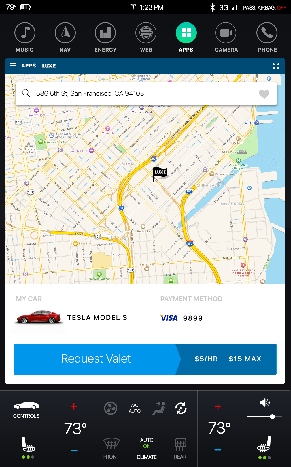
Valet on the go
One feature I would love to see is the ability to request valet service from anywhere. Here’s an example of a user using Luxe, an on-demand valet service app, through their Tesla dashboard.

Hotel Booking
Another awesome feature would be the ability to book hotels on-the-go without having to take out your phone. Here’s a look at the Hotel Tonight app integrated with the Tesla dashboard interface.

Unlimited possibilities
Some other examples of apps could be food ordering, shopping, gas delivery, an insurance estimator based on your driving habits, just to name a few. The possibilities for connected Tesla apps are limitless.
